Project Overview.
Project Title: ADN Prefabricate
Client: ADN Prefabricate
Project Date: Aug-Sep 2023
Project Type: Rebranding and defining the visual identity
Challenge.
The objective was to come up with a visual identity that better represented the core business activities. Balancing a mature persona with a youthful and contemporary approach, the design aimed to cater to a diverse audience, including construction professionals, architects, investors, and administrative authorities.
One of the primary challenges lay in the brand name “ADN PREFABRICATE” which presented minimal symbolic associations for visual interpretation. Consequently, the strategy focused on leveraging “ADN” as a medium for visual expression, allowing for the development of a cohesive system that complemented the brand’s identity.
The rebranding initiative aimed to maintain a consistent and trustworthy image, enhancing recognition within the competitive B2B landscape and fostering a stronger connection with the audience familiar with the company’s core operations.
The resulting visual identity can be a relevant submission for this competition, because of its creative yet strategic approach blending creativity and a bold stance. It relies on simplicity and effective representation with modest resources involved.
In a rigid sector, this visual identity brings a youthful atmosphere, and helps the company stand out for a diverse target audience, and positions them as innovative and dynamic within their internal culture.
Solution.
The project can be defined mainly as a rebranding initiative driven by an internal decision to differentiate the precast concrete division from the main construction business with a new name and its own visual identity system.
Requirements.
The client’s request included a visual solution or a symbol that resonates with the target audience, along with a creative and straightforward implementation method that is both clear and easily comprehensible, encompassing a strong and mature personality with a young and modern attitude. Another specific client request was to have a symbol/graphical element easily recognizable by their target audience — specifically, the people relying more on the technical side, without too many creative inclinations.
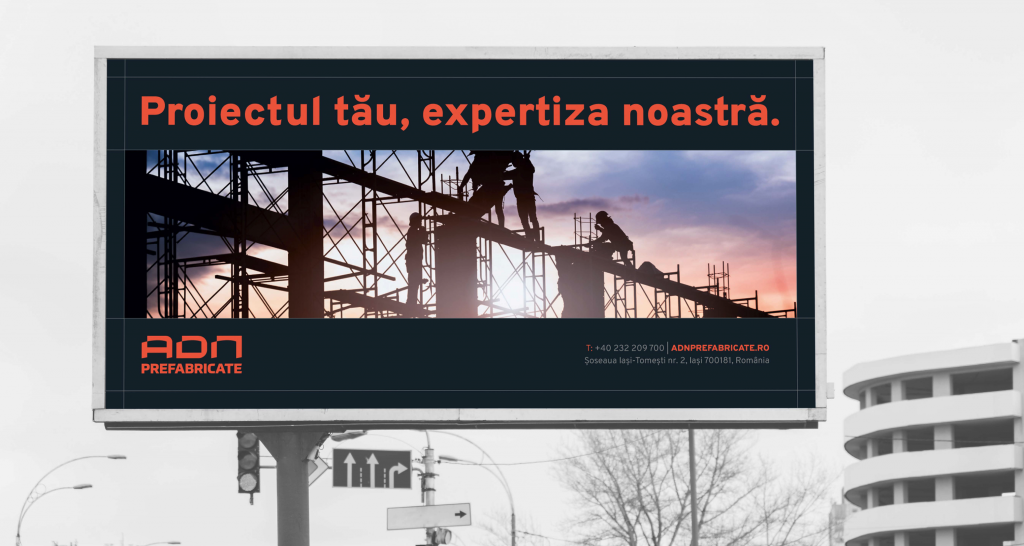
Objectives.
The main objective of this rebrand was to uphold a consistent and reliable image while embracing a fresh visual identity, ensuring distinct recognition among B2B business partners. An equally important one was to ensure a transfer of values and other brand strategy elements from the parent company to the subdivision while presenting as a modern and skillful partner.
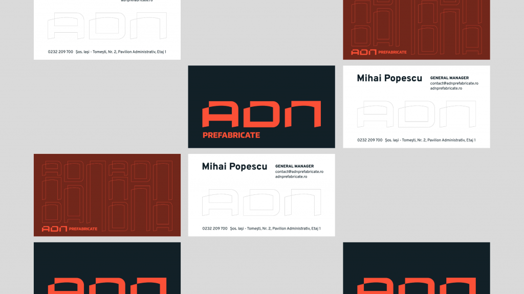
The target audience is wide and diverse within its sector – composed of constructors, architects, investors, or administrative authorities. One particular challenge in coming up with a visual solution for this brand was the name, provided by the client and of value to them in meaning. Composed of something that resembles an acronym, “ADN”, and a descriptive word for the business’s main activity, “PREFABRICATE” (translated to precast concrete). The full name wasn’t one from which we could have started visual associations or derived meaning, therefore the solution in this case was to treat “ADN” as a medium for visual expression and develop a system that complements it.
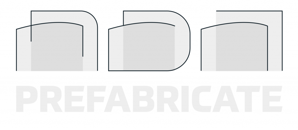
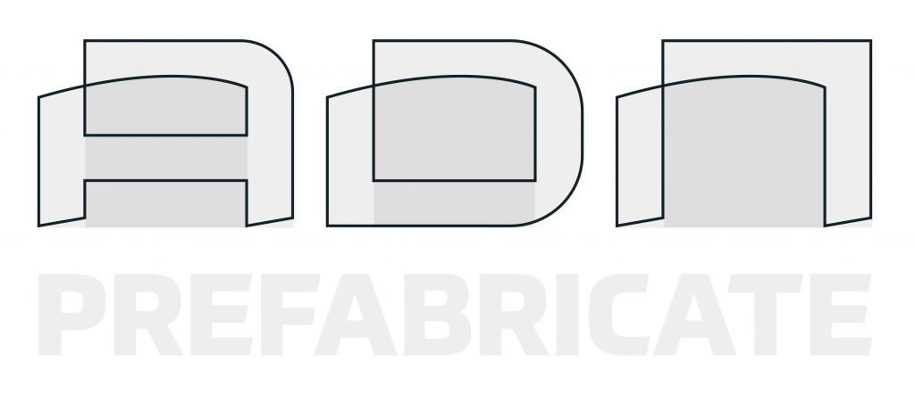
The inspiration for the ADN letters shape started from the technical drawings of beams and curved elements found in roof structures (precast concrete curved elements). The two shapes are intertwined and joined by diagonal lines as seen in some T-shaped or I-shaped beams.
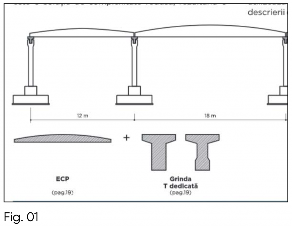
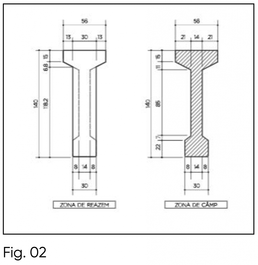
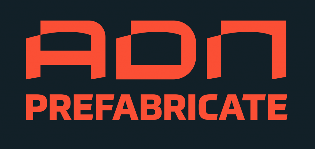
Further on, the naming is completed by a bold, strong font that shares a similar diagonal cut on the ending of the letters PREFABRICATE (example in next slides).
1. Logo, composing lines.
2. Logo, full outline shape.
3. Final logo.
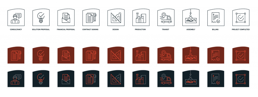
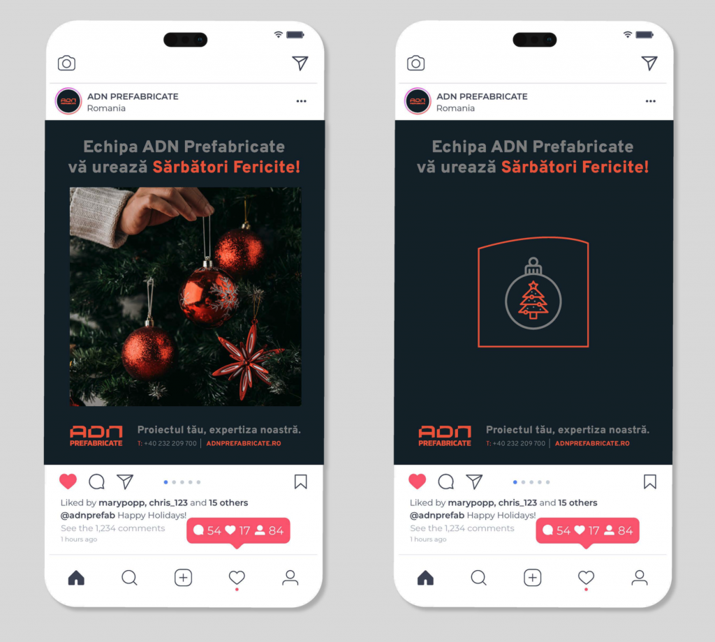
In the visual identity implementation, two graphical devices are used as starting points for the implementations: one is the arched line from inside of the ADN letters, further used as a frame in layouts and the base shape for developing icons. This shape can be further extended to other applications (even in a physical format such as pins) since this is the leitmotif of the visual identity.
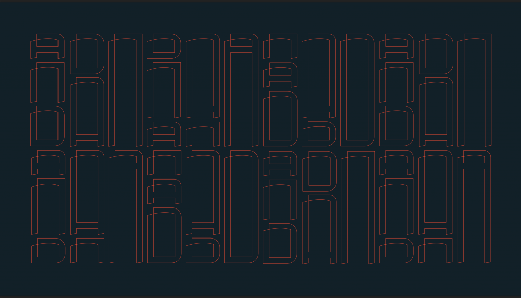
The second one is a pattern composed of outline ADN letters varying in height, creating a column-like composition that reminds one of the construction sector — the final medium in which the business conducts most of its activity.
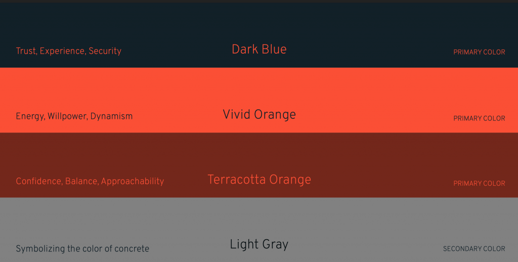
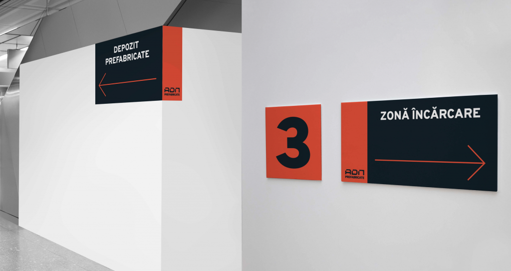
The dynamic in the visual identity application stands between the use of color, typography, and graphical elements (ADN outline. pattern, and icons). The overall image should be modern, bold, steady, and effective.

The logo can be used in various backgrounds and color combinations and same rules apply to the pattern and outlines as graphical devices.

4. Icons and design systems.
The icons can be used in outline format or full color in different combinations.
The project’s success lies in its ability to effectively differentiate the subsidiary from its parent brand, elevating its presence as a distinct and influential entity within the market. Considering this to be a more rigid sector, one in which most brands rely on little to no creative elements in their visual identity, we consider this solution to be a step forward.
Conclusion.
The rebranding was welcomed by the shareholders and company members and implemented throughout their channels. Communication efforts will continue until the final consolidation of the new image.
Contact us at hello@subsign.co for branding consulting and long-term strategies to help your company find its identity.
