Basics.
Let’s start with the beginning, websites and apps have the main purpose of delivering a message from which the user can act upon, either submitting to a platform, making a transaction, reading or viewing something, etc.
The average time that the user spends for the first time on a website is about 10 seconds before deciding if they want to find out more or leave the website. That was 3 years ago, now it’s down to 6 seconds. Once you’ve got his attention you have about 59 more seconds to convince him that your services/products are what he’s looking for.
In order to convince him to take an action or come back to your website, you would need a mix of fresh content, simple user experience, and a great design. I’ve specifically put them in that order because you can’t have a great conversion rate with a great looking and working website without great content.
But you could easily have it the other way around, just look at Amazon or Reddit, they have a ton of useful content but their design or user experience isn’t wow.
On the other hand, there are amazing websites that you can control them with your mobile device on the desktop, have cutting-edge technologies, even VR browsing experiences that are really fun for the first 2 or 3 times you visit them, share them to a friend, and then forget about them.
The Content.
This means that the content plays a really significant part on the way you interact with the user, and we all know how fast nowadays the content is being created, each day you get to scroll through hundreds of articles, posts, videos, etc. Having weekly or monthly updated content on your website creates a fresh and dynamic look of your business and brings the Bounce Rates down.
Even though your business isn’t a publication platform, show the users what you’ve done lately, give them small insights into your business, if it’s Instagram photos from your local burger joint or a huge multinational company.
The User Experience.
Once you have content you start thinking about the people that you are addressing and start to create personas for which you are making the website or the app.
This can easily be a two cutting-edge sword, either the audience is too broad and you don’t really outline any identity, or you go in to specific and lose out to the major audience.
For example, a great shot on Dribbble can have about 300 likes in 24 hours and a similar post on Instagram can have upwards to 1000 likes in a couple of hours. Now, before you say anything, they’re both publishing platforms, and mainly both of them use the same layout (one shot/photo, hashtags, small descriptions, and a comment section).
Instagram is aimed at the general public, wheres Dribbble is aimed at a very specific niche of designers. It’s all up to you who are you targeting.
After you define the personas you start making scenarios of how will they navigate the platform, their style preferences behavior patterns and so on. Ideally, you would want to have access to a test group of people that are within your audience groups and see how they interact with your product.
This creates a loop between testing and creating and that result is valuable real-world feedback before even hitting the market.
“If you want a great site, you’ve got to test. After you’ve worked on a site for even a few weeks, you can’t see it freshly anymore. You know too much. The only way to find out if it really works is to test it.” Steve Krug, Don’t Make Me Think: A Common Sense Approach to Web Usability
A lot of designers try to educate the user using highlights, subtle cues, even tutorials for apps, all of this will just make the experience more difficult. Don’t educate the user, understand him.
The Design.
This is where we shine, finally, we have all that amazing content, all the flowcharts, wireframes, case studies and we try to combine them with the brand book in order to deliver wow. A good User Interface designer will make an amazing looking product, whereas a great designer will create an extension of your brand, keeping and using all that the brand is known for, colors, fonts, icons, etc.
The design phase is like that magic stew witches cook with all sorts of weird ingredients, and like any cook, or respectable witch, there should be only one in charge of that specific project. Nowadays designers are more niche-oriented, some of them are great at UI and some of them at UX, but I strongly believe that you can’t have a great experience of the product if either of those elements doesn’t live up to the task.
A great looking interface without a well-thought experience behind it is totally useless, where a well-thought experience without an interface is just a bunch of boxes, spreadsheets, and placeholders, so there needs to be a coherence between both of them.
LinkedIn Case Study.
LinkedIn, as many articles and blog posts suggest, has a bit of an identity crisis, they’re not really sure if they want to be a publishing platform or a social media one. Both of them have one common goal, to keep the user focused on the content, this is their biggest Call to Action, scroll. The main difference between them is the quality and the quantity of the content.
Let’s look at that into more detail, Medium is a great publishing platform, they have curated articles, editor picks, reading history, etc. its really easy to find a specific company or publisher, read their articles and start following them. In most of the cases, chances are you will be following them because of the content and not because you know them or are related to them.
On the other hand, you have social media, which has tons of content, but not really quality content. Here you follow friends, relatives, acquaintances, people you like, look up to, but the content you expect to see it’s not really specific, it’s more like a mix of videos of cats, random things, fashion posts, angry people and so on.
You don’t really know what is going to see in the next post. But this is actually good because here is where the majority of users are, and just like in the Dribbble/Instagram example from above you get a lot of views and engagement (if you target the right people).
Let’s go even deeper, and analyze the user experience patterns for both of them. Publishing platforms (Youtube, Reddit, Medium, etc.) show you the content first and then secondary, you will see a Botton or an option that would allow you to add content, and depending on the platforms there are several small steps you need to go through before publishing it.
A social media platform is more focused on actually adding content, Facebook has a big “What’s on your mind” section above all the other content, and you don’t need to go through any steps, you just upload a photo, or write anything that’s on your mind and hit enter.
Same applies to Instagram, you open the app and you have the option of adding a photo to your timeline or a story, not to mention Snapchat which just opens up your camera when you access the app.
The problem with LinkedIn is that if they go with the social media platform approach they will get a lot of cat videos and random content, whereas if they go into the publishing platform users won’t connect as easily with companies and vice-versa.
The Redesign.
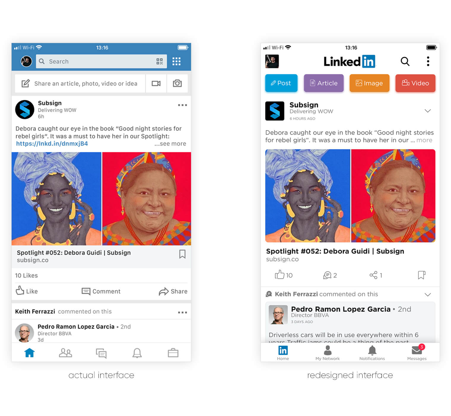
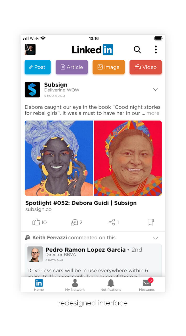
Keeping in mind everything we’ve discussed earlier I’ve decided to put together all the knowledge beforehand and come up with a more coherent experience and a more unified interface between the desktop version, the brand guidelines, and the mobile app. In order to do this, we’ve made target personas that would use the app and showed them the actual app.
Their feedback was really useful, having a lot of questions about the existing layout i.e.: “what are all those buttons on the header?”, “why is there the bookmark icon not aligned with the rest of the action buttons in the posts?”, “what exactly are those buttons in the footer, especially the briefcase?” and many more.
Having in mind these questions as well as our own ideas and suggestions we’ve come up with a more coherent and cleaner app that would make the users’ journey really simple.
Header.
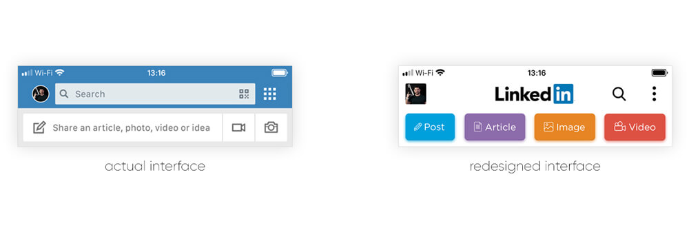
I understand that the background color is really important to the brand values, but I think that works great with really easy to recognize colors, like Facebook or Youtube. In our redesign, we’ve decided to go with a simple, white background and use the actual logo to showcase the brand.
Another direction everyone’s taking is making the avatar round, at first Instagram, and then Facebook, now LinkedIn. Think Different, is everyone zigs, let’s zag, especially that we have the rounded edge square from the “in”, let’s use that on all the avatars (even if their companies or users).
One of the most debated features we’ve needed to redesign was the search section from the header, do we make it a button and keep the rest of the design simple and clean, or do we make it an input field on that would take up almost the entire header but it would remove another tap from the users journey.
The final decision (the search button) was based on the users’ behavior and could be put to an A/B Testing period later on when the app would go live.
If the users come to this platform just to search for specific people or companies, then yes, let’s go with the input field, but his means that the users will miss the most important Call-to-Action, scrolling down to see more posts. If the users just come to the app for new content, articles, and updates, then let’s keep it as it is, mainly because this promotes the content.
Promoting the content is really important, but in order to promote it, you would need users to post it. Keeping this in mind, and answering the users’ questions, we’ve decided to make it dead simple and using the LinkedIn color codes added 4 new buttons that boost conversion. Just with a glance, users understand the type of content they can add, and who simple it is.
Content.
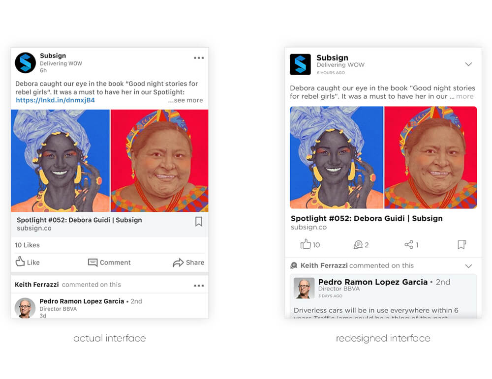
We’ve kept the overall layout, however, we’ve made them more coherent, same round shapes from the avatar are now found in the post image, and in the referral feature as well. The post interactions are now simplified, we don’t need to have a link button, and read above the number of likes.
The same applies to the rest of the options, and now we’ve brought the bookmark option bellow, with the rest of them.
If there is now, bookmark option, then we would should a different option or remove it all together.
When someone is interacting with a post (a friend of yours liked or commented on something) we will highlight that even more, by using the full icon of that specific action. Also, that specific post that they have interacted with will be shown on with a different color.
We’ve also decided to go with a more spaced font, that would be easier to read but at the same time would have the same overall type shape as the logo. For this, we’ve decided to go with the Gotham Font Family, especially the Book and the Bold styles.
Footer.
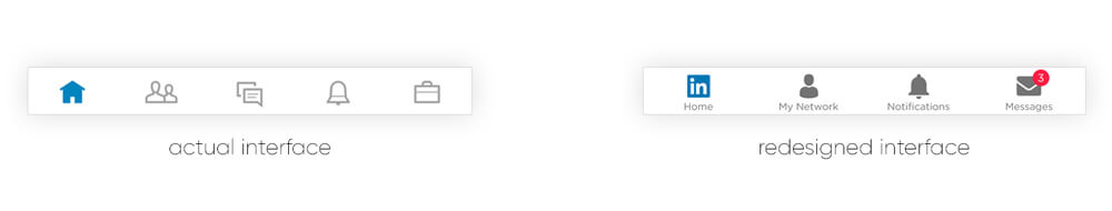
The existing LinkedIn App footer has 5 buttons without a description, and like our persona tests, most of them don’t understand their functions. The current one has a very similar icon used for the message icons as the one used for the post comment.
Here we’ve decided to simplify it even more, removing the jobs icon, and moving it into the search option from the header. It’s the same search behavior as searching for a job or a company so it only makes sense to use it in the same section.
The message icon is now different from the comments, and all of the icons are now full (for a greater visibility) and have descriptions. Also, we’ve decided to replace the home icon with the more recognizable “in” icon.
Final Notes.
We really appreciate the work LinkedIn has put into their Desktop and overall image in the last years, and certainly don’t want to say that their mobile app does not live up to their standards, however, we do think that it needs a redesign and it needs to be taken to our time and age.
It’s simple, just listen to your audience and try to be different, stand out from the crowd.