As said by renderforest.com, the logo is the number one brand identifier with up to 75% of customers identifying it first rather than let’s say its TOV or signature color. On the other hand, “60% of consumers avoid brands that have odd, or unappealing logos, regardless if they received good reviews.“
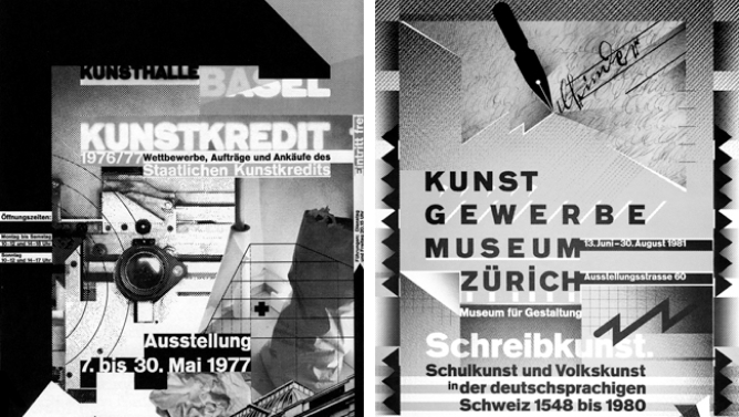
Just take into account how many times you walked down the street and saw something familiar of a logo that you know and immediately thought of that. The correlation needs to be created in time. One of our favorite examples is McDonald’s, a brand that has started to use less its logo but rather counts on the consumers’ imagination and memory for it.
In order to achieve that, you need to make sure that you have a good base. The logo will evolve through time and trends, but the idea must always be there.
We made a list to help in that process.
Checklist:
✅ Does its style match the personality of the brand?
✅ Are the colors appropriate for the target market? Here is a small tool that can help you decide.
✅ Does the logo work in black and white?
✅ Is it legible and easily readable?
✅ Is the form clean and simple?

✅ Will it work when scaled down to the size of a thumbnail?
✅ Does the form have good balance and proportions?
✅ Is it free of fine lines or small details that will get lost at small sizes?
✅ Will it work on all the channels you need to use?
✅ Is it different from your competitors’ logos?
✅ Is it free of any trends that may cause it to look outdated in a few years?
✅ Is the logo memorable?
✅ Has the logo been designed in a vector format?
If you require any assistance with your own logo, marketing, or advertising campaigns give us a shout at hello@subsign.co