Having clients from different industries challenges us, but also helps us improve with every project that we take to deliver the wow.
TGI Term is a regional company that was founded in 1995 and activates in the construction sector. Their objective is to deliver high standards services with a german quality. They work both B2C and B2B, having a wide range of projects in terms of urban development.
Their promise to each customer is: Safety and protection with dedicated solutions for their needs.
What’s a brand?
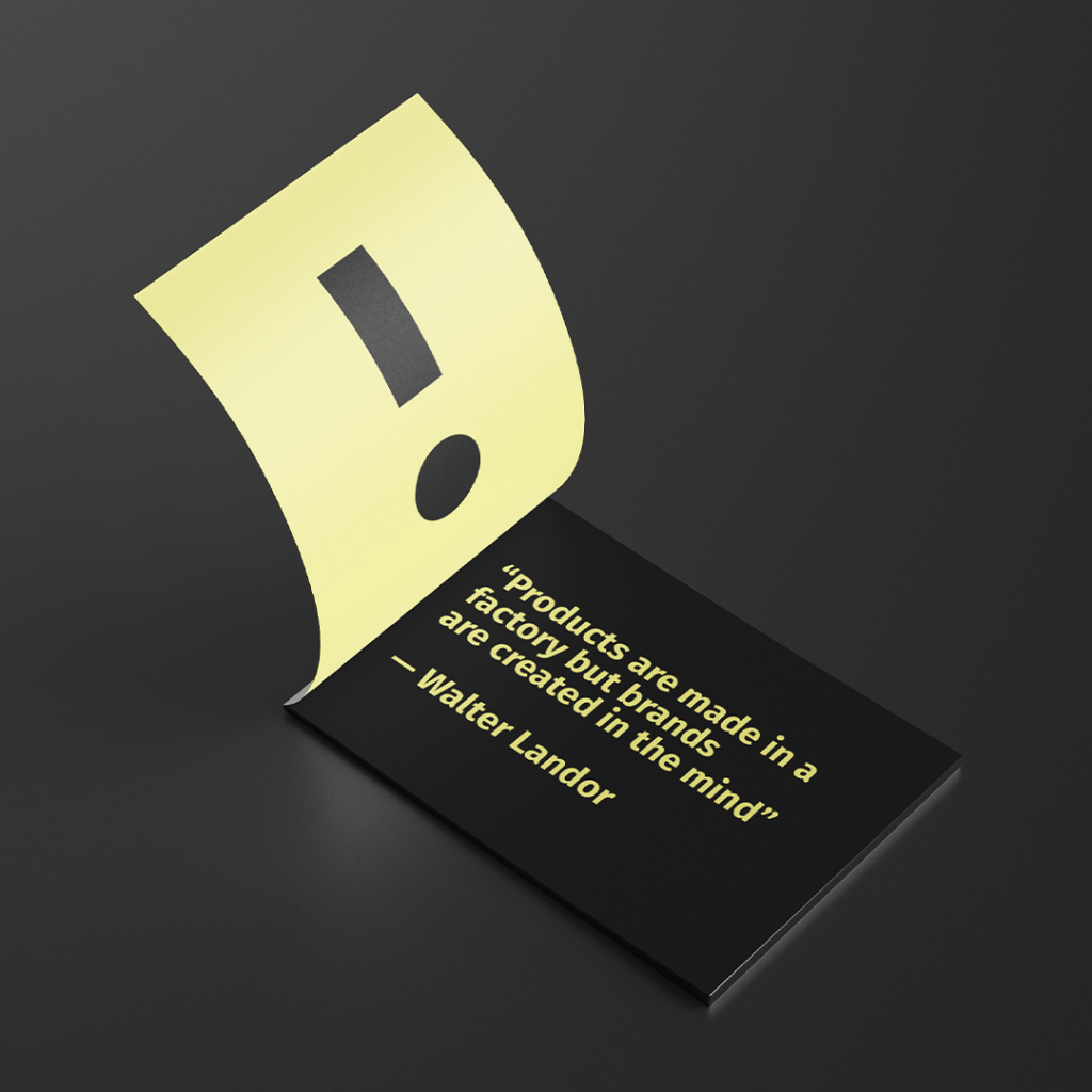
“A brand is a name, term, design, symbol, or any other feature that identifies one seller’s good or service as distinct from those of other sellers” — American Marketing Association.
Furthermore, compare a brand with the idea or the image that people have in their minds when they are thinking about products, services, and activities. So, therefore it isn’t just the physical features that create a brand, but also the feelings that a consumer can develop towards the company or its products. The mix between physical and emotional is triggered when exposed to the logo, visual identity, but also to the message communicated.
Our involvement.
“Branding is what people say about you when you’re not in the room.” Jeff Bezos
TGI Term set out to build a long-lasting brand and to branch out. Thus they needed a rebranding that would stand the test of time.
Their vision: “Quality makes the difference.” With that in our mind here is the whole project.

The first step was to have a brief set out to the key stakeholders (employees, clients, and partners). After we gathered this information we drafted the real company values, the differentiators, and the current day brand perception.
The concept.
Through the briefing and research process we found out that there are some problems in terms of communication, external and internal, so we had to see a solution for this. But another interesting thing that we discovered was that every single stakeholder defines them as a company that is reliable, trustworthy, and gets the job done as promised every single time.
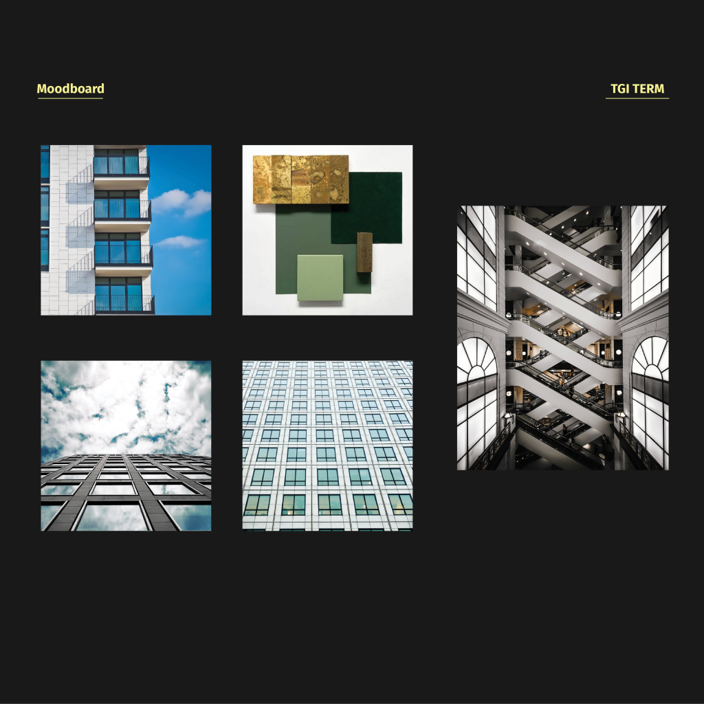
A brainstorming, a mood board, a play with colors, and geometric shapes helped us a lot in crafting the new direction.
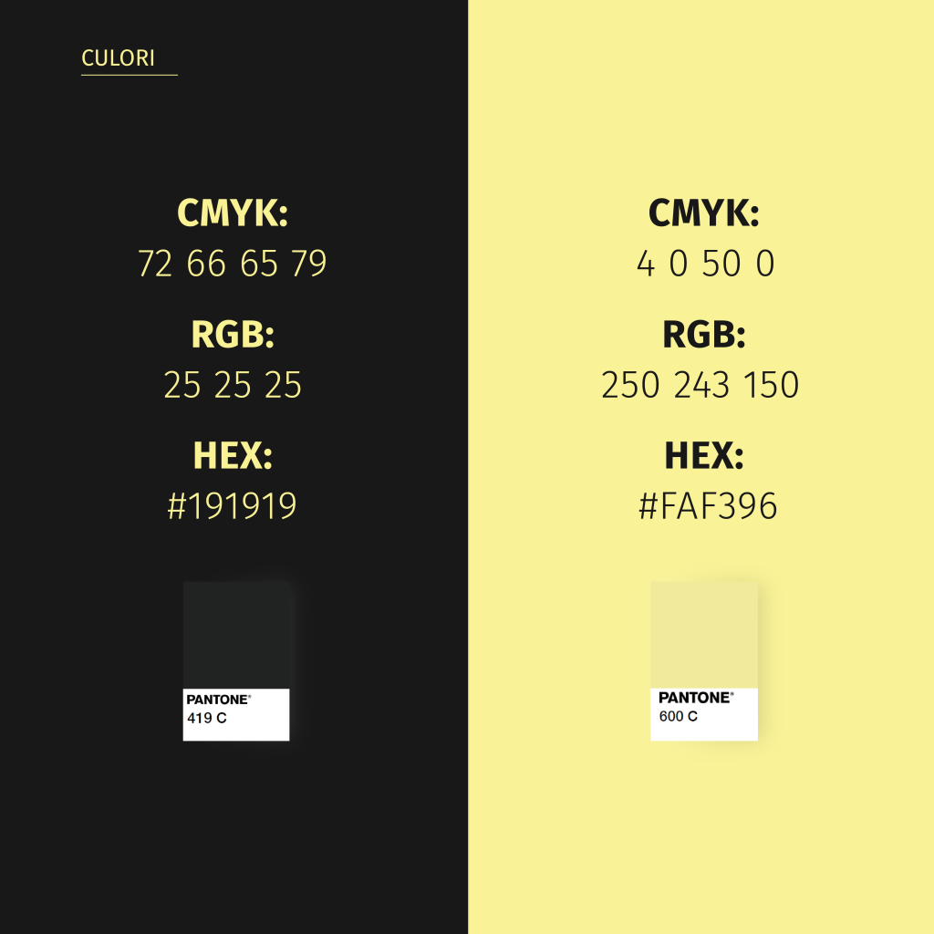
For the color palette, we looked for more natural, earthy tones, but we also went into a more technical area, that’s why we have chosen the “yellow post-it” as the highlighting element so to call it. The color of the technical sketches with the black, that for them would represent seriosity and quality gave us a bold impact.
Communication.
The tone of voice as well as the message itself is very important in any organization’s communication. An alignment between the way a brand is speaking and what it is trying to transmit to its consumers is the living proof of professionalism.
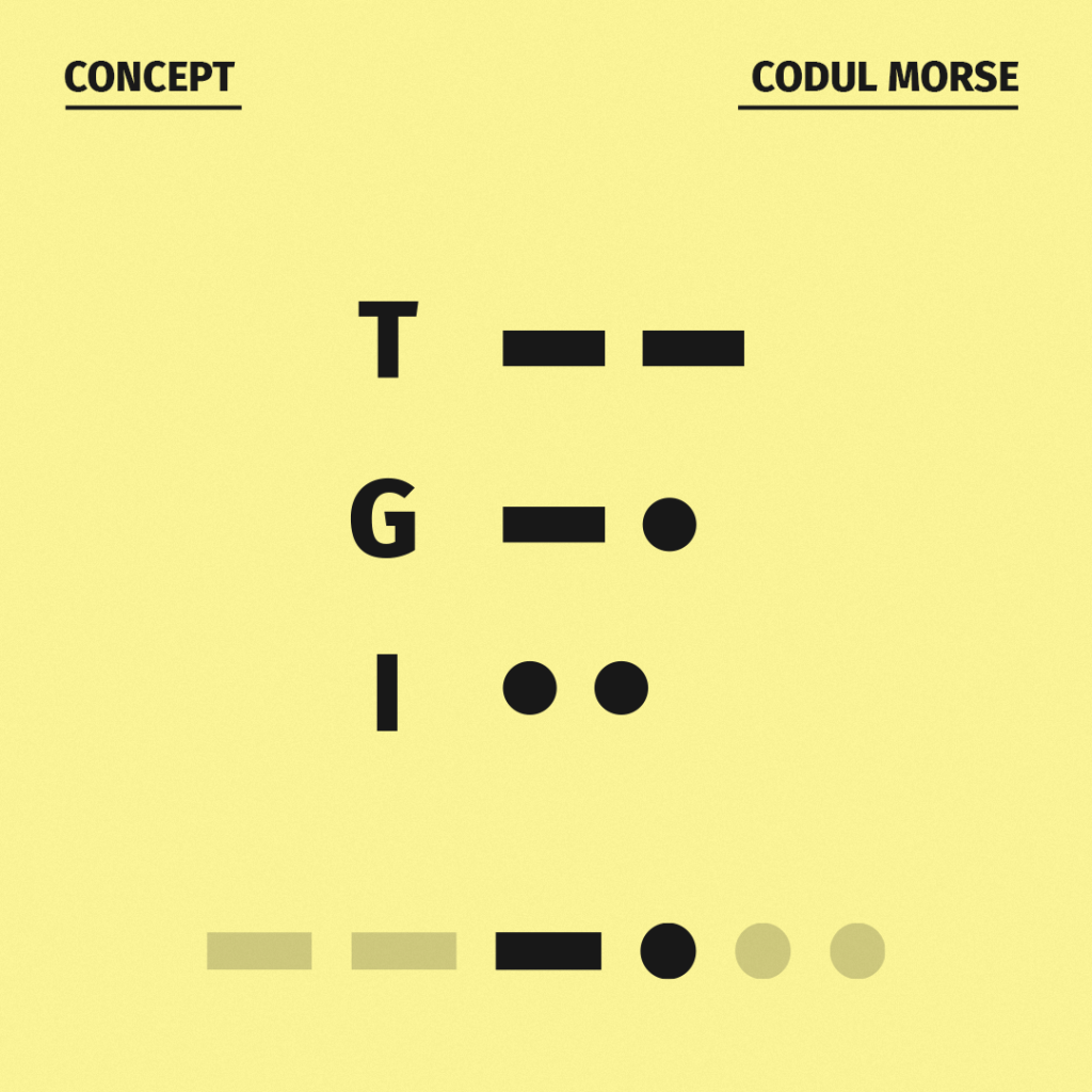
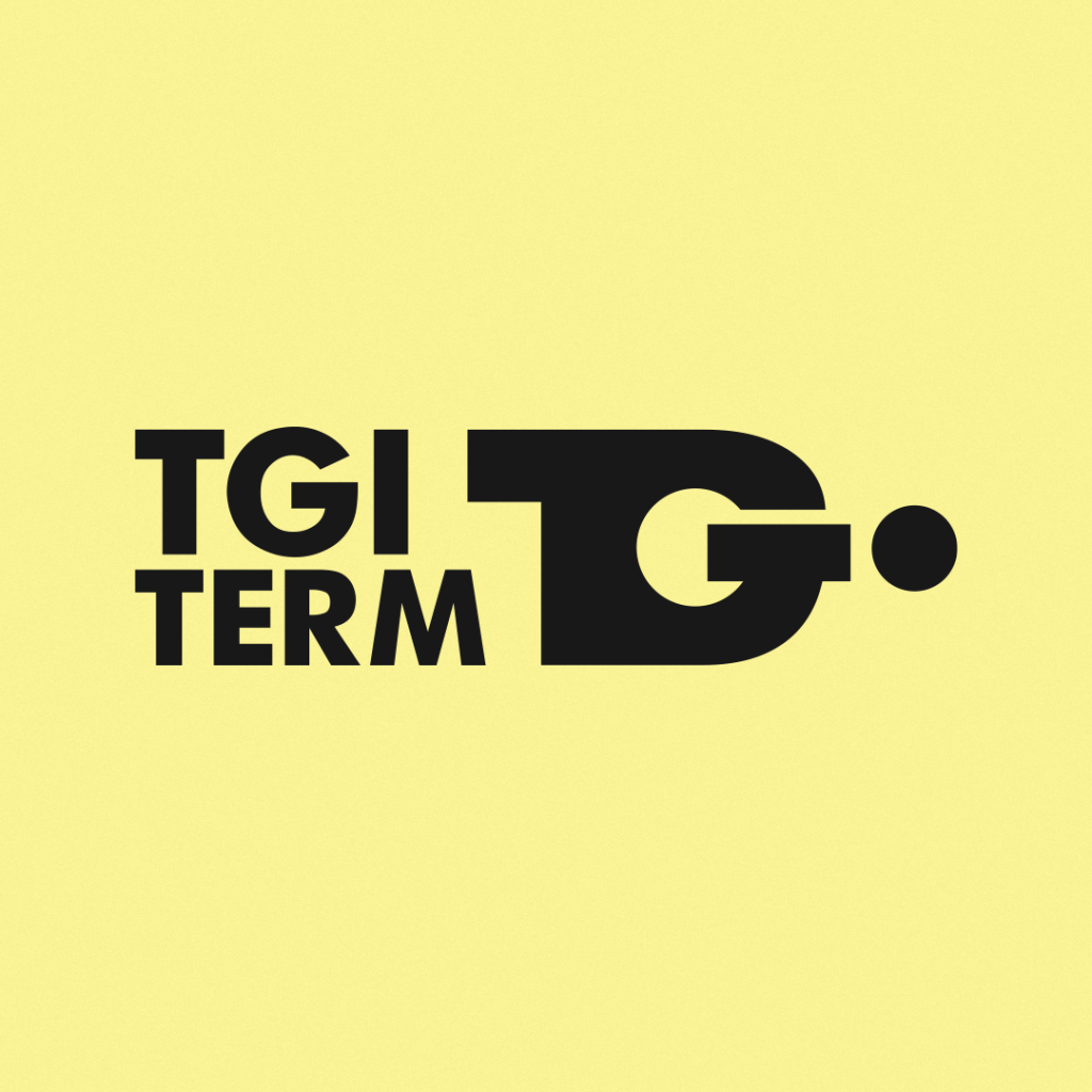
So, we came up with a concept for the logo that also addresses directly the communication issue, thus making it a brand purpose of solving it. We choose to use a universal language, more exactly the Morse Code.
That’s how we created their logo from the Morse “alphabet”. The “I” at the end is a hidden message, and it can be used to highlight anything that matters to them.
TGI’s tone of voice is conversational, open, and energetic communication, with a dash of humor.

We took the history behind the company and metamorphose it into a modern, more minimalistic one. We made it simple, big, and bold, so it can be used in a multitude of mediums and spaces, without taking focus away from what is important or the essence.
All the digital and print materials created are aligned with their core values and strong mission statement. From office supplies to uniforms and buildings images, everything shows the same message, that quality and seriosity are what recommends them.
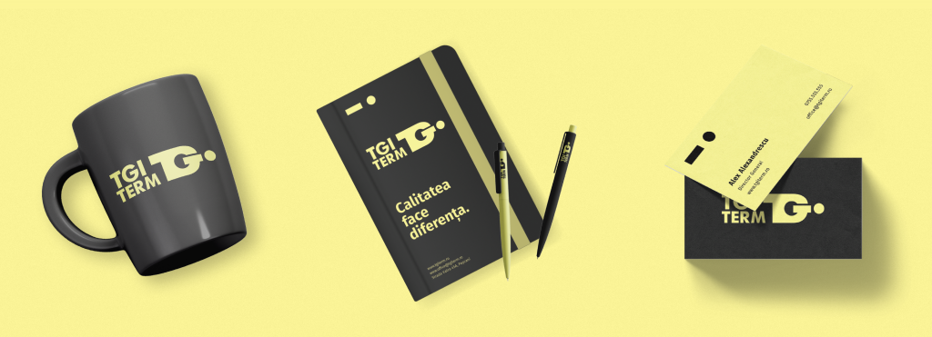
To keep the brand inline with all aspects we made a brand manual that can help any person who is in need to design, communicate or represent TGI Term as well as a sneak peek into what is the true essence of this brand.
The conclusion.
We know that these days, the first impression is very influential because there are tons of brands that may sell the same product/service/activity as yours. But the passion for the job you are doing, the devotion to the client, the close attention to the smallest details, professionalism, and the power to keep up with technology are the things that will allow you to truly stand out and be an everlasting brand.

Give us a follow for a more digital marketing strategy to help or feel free to send us an email at hello@subsign.co for collaborations or help with your brand’s presence and content.
