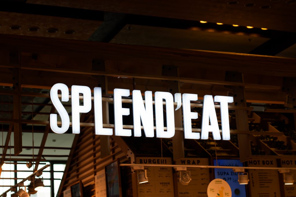
SPLEND’EAT is a small restaurant in Iași, Romania, that started with the desire to bring a healthier and fresher option for meals to the people. Their vision is to prepare tasty food with fresh ingredients and every single time you eat it, to feel good, to feel ”SPLEND’EAT”. They are located in a mall, in the food court area, so that means they have to stand out somehow, among the other food vendors around there. They aim to target and to engage with the 16-35 demographics.
The guidelines.
The business has identified two main age segments for which they’re building their products. On one hand, they address to the youngsters, the cool kids in the block that are always in trend with everything that happens around them. From SM and being some sort of influencer to the „eat healthily, you are what you eat” culture. On the other hand, the corporate employees that are working in the offices located inside or around the mall.
For starters, our help consisted of giving the design and look of Splend’Eat a refreshed look. Starting with the menu design, through which the clients interacted the most with the business since it’s one of the things that you observe with a quick look at the location.
Concept.
“Perfection is achieved not when there is nothing more to add, but when there is nothing left to take away.” — Antoine de Saint-Exupery
We know that we live in a world where „content is king”, but before this, it all starts with a strong base. A must for every brand is to have a strong concept, an idea behind a design. From this, we started our creative process. We analyze the position of the brand in the consumer’s mind, the audience, their location, and of course, the products.
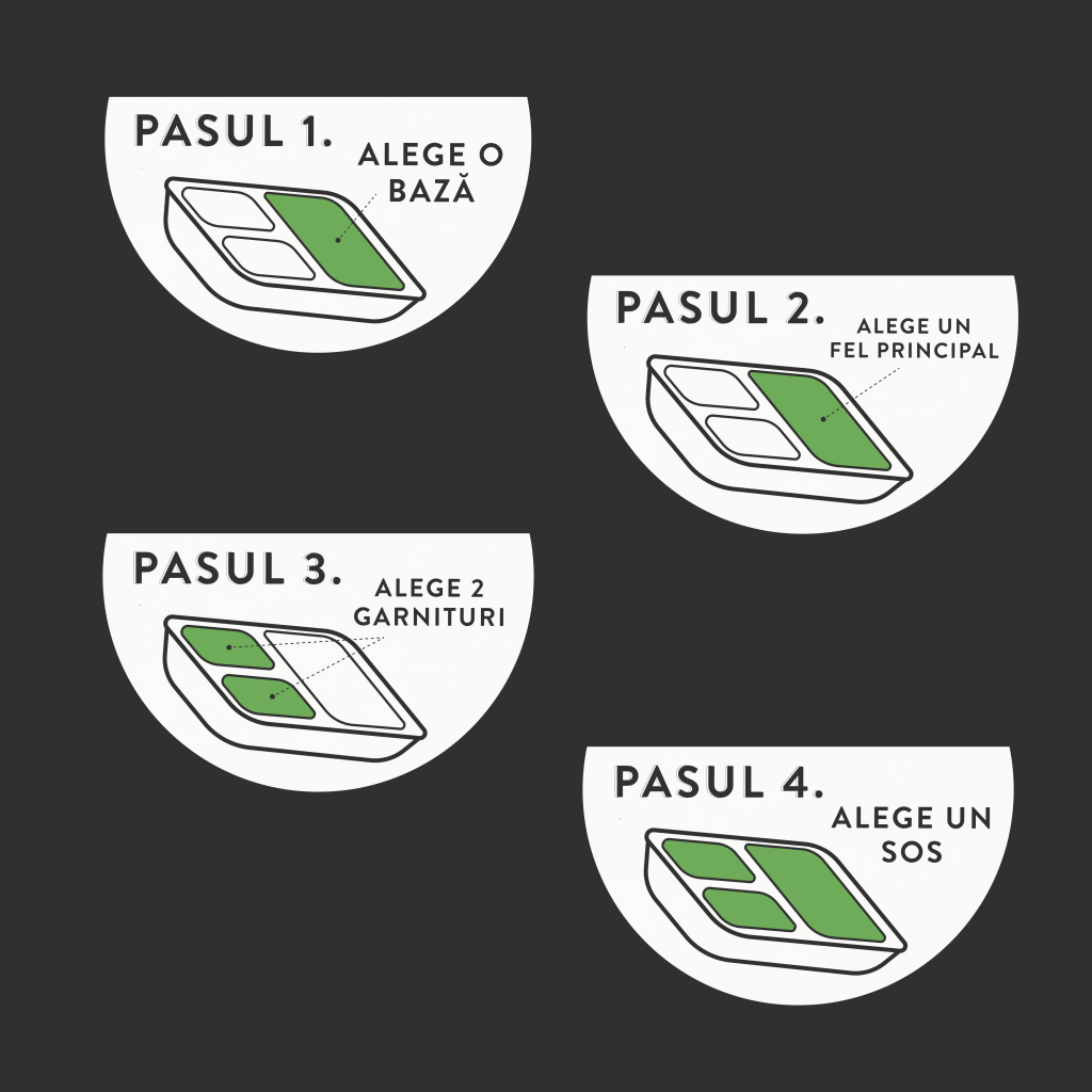
The way they do their food – few ingredients, simple, but tasteful.
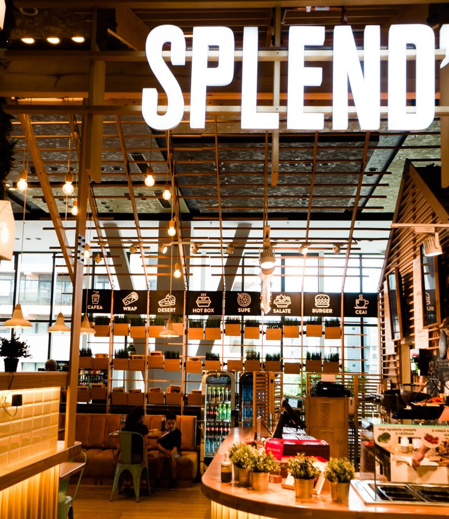
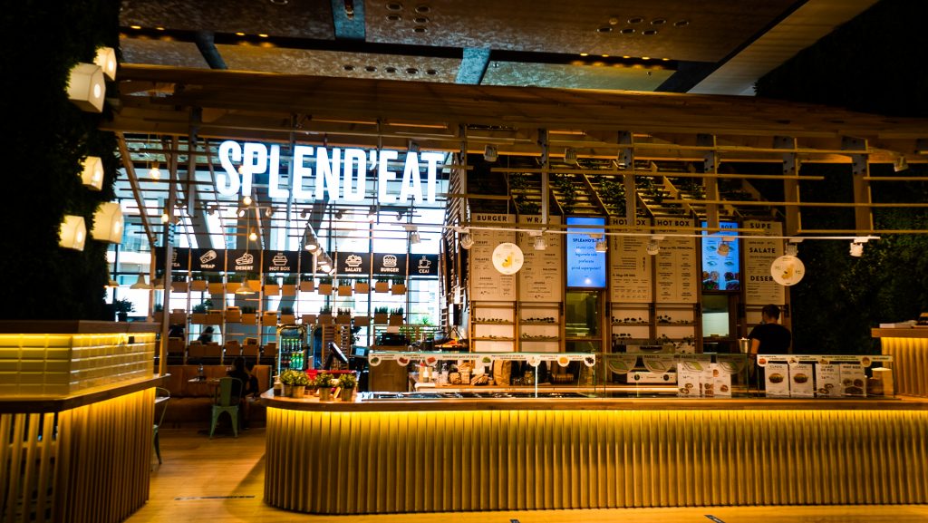
What is really cool is the fact that SPLEND’EAT location is a really awesome one. A combination between nature lover and industrial interior design, with soft lights and a very cozy and warm atmosphere. When you step in the location, you have immediately a good vibe. So, we thought, they have this amazing location with trees, leaves, warm light, wooden tables, why over complicate things?
History of Minimal.
When we say minimal, we often tend to think about nordic interior design and architecture, more exactly at IKEA. Being in fashion now to have a minimal deco house or even a minimal outfit style, so it is in digital design. But is this concept new? Not really, the whole „minimalistic design” actually started in traditional Japanese culture, because at the core of it where the value of balance and simplicity.
„Less is more”, with other words the founding principle of minimalism.
But what does exactly this mean? The idea is that the more elements you feel tempted to add to the product, the more complex you are making it, when in fact it isn’t necessarily what you need. Here is where minimal jumps in, as a natural reaction to a trend of having more complexity for digital products.
Stand Out.
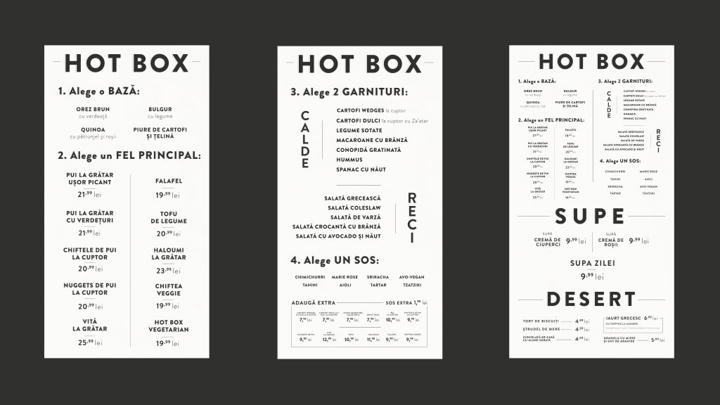
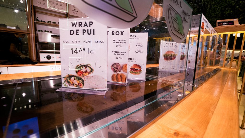
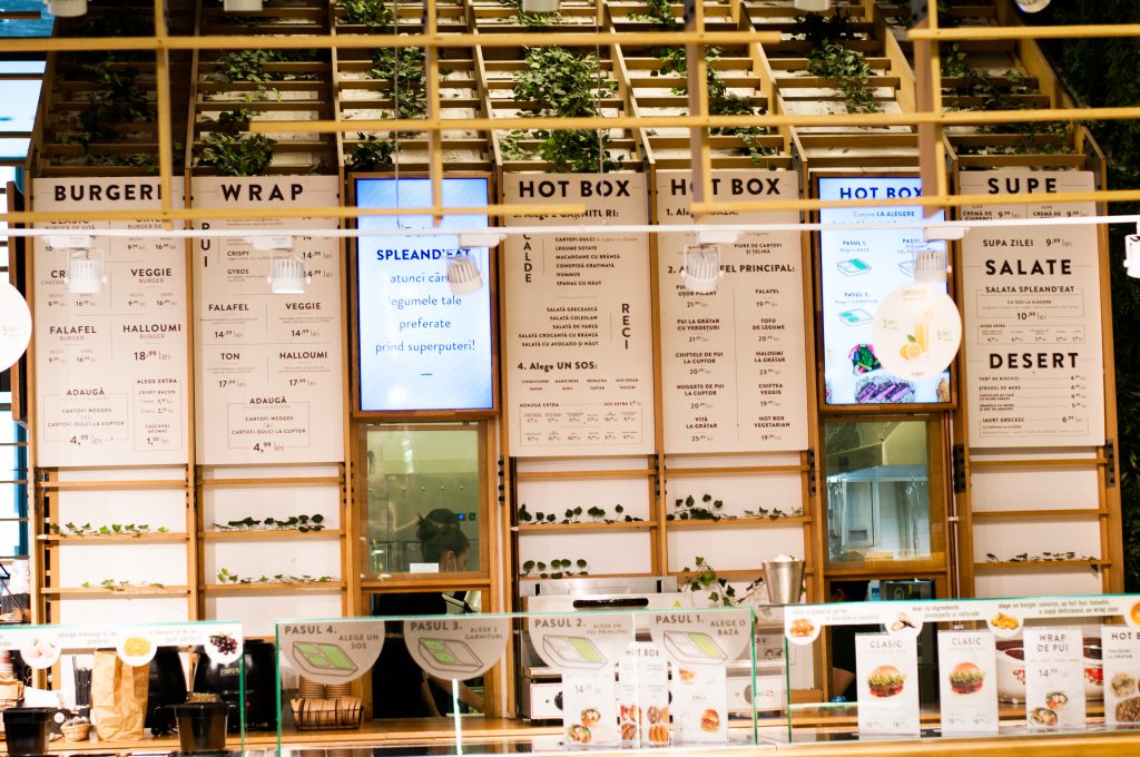
We created the menu in such a manner that the food speaks for itself. Simple, clean, and straight to the point. We set out to make the menu “blend in the jungle”, but also to stand out among the others. Comparing to the other vendors, SPLEND’EAT has the coolest location, so why not making it sparkle, instead of having lots of complicated and maybe kitsch menu design with tones of elements.
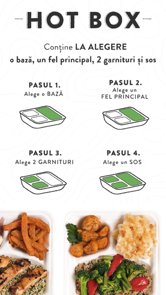
Because these days user attention span is known to be very low, we have to “underline” the products. We brought doodling in the menu, to address to the younger generation, but also the clean lines to keep it simple and appealing.
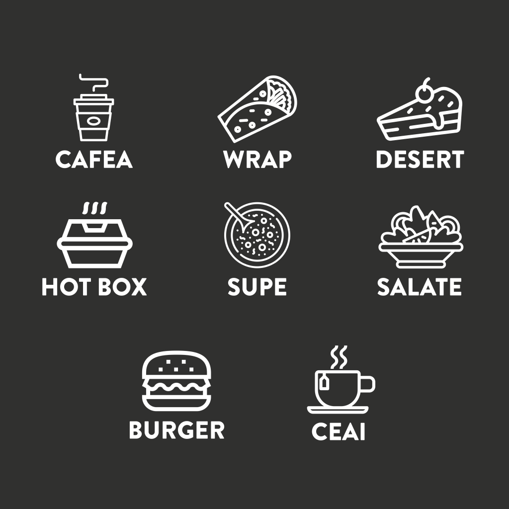
Each product category has its own design, sustained by doodles.
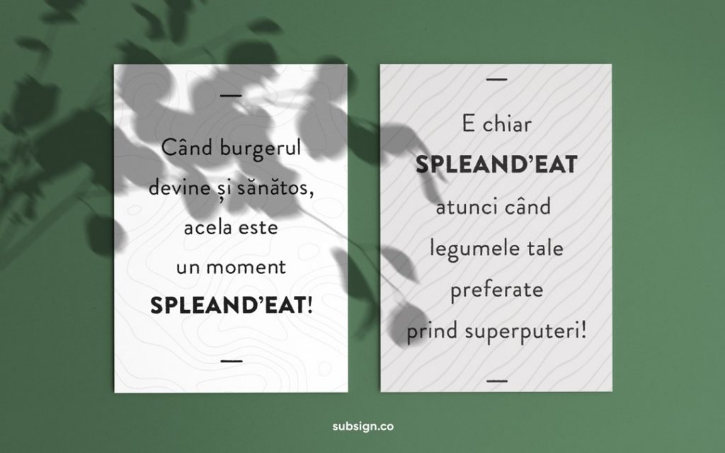
We supported all the design menus with short and simple animation, just as catchy and attractive to the consumer’s eye.
Fast Food with a twist.
They sell smart food fast, making it easier for you to choose a healthier option when you want to eat in the mall.
“You don’t need more space. You need less stuff.”
Conclusion.
Even though we didn’t create all the brand design, we did put our fingerprints on the menu and the details of the location. Our purpose was to bring more the product and the location in front of the consumer.
We aim for every detail of the whole brand to work smoothly and perfectly together, to be cohesive. An important aspect of branding is the fact that every aspect of it should work hand in hand, to tell the same story. Even though not all elements should look just exactly the same, it should fit together, piece by piece, just like a puzzle to form a bigger picture.
Our help – simple, minimal, tasteful, just like their food.

Give us a follow for a more digital marketing strategy to help or feel free to send us an email at hello@subsign.co for collaborations or help with your brand’s presence and content.