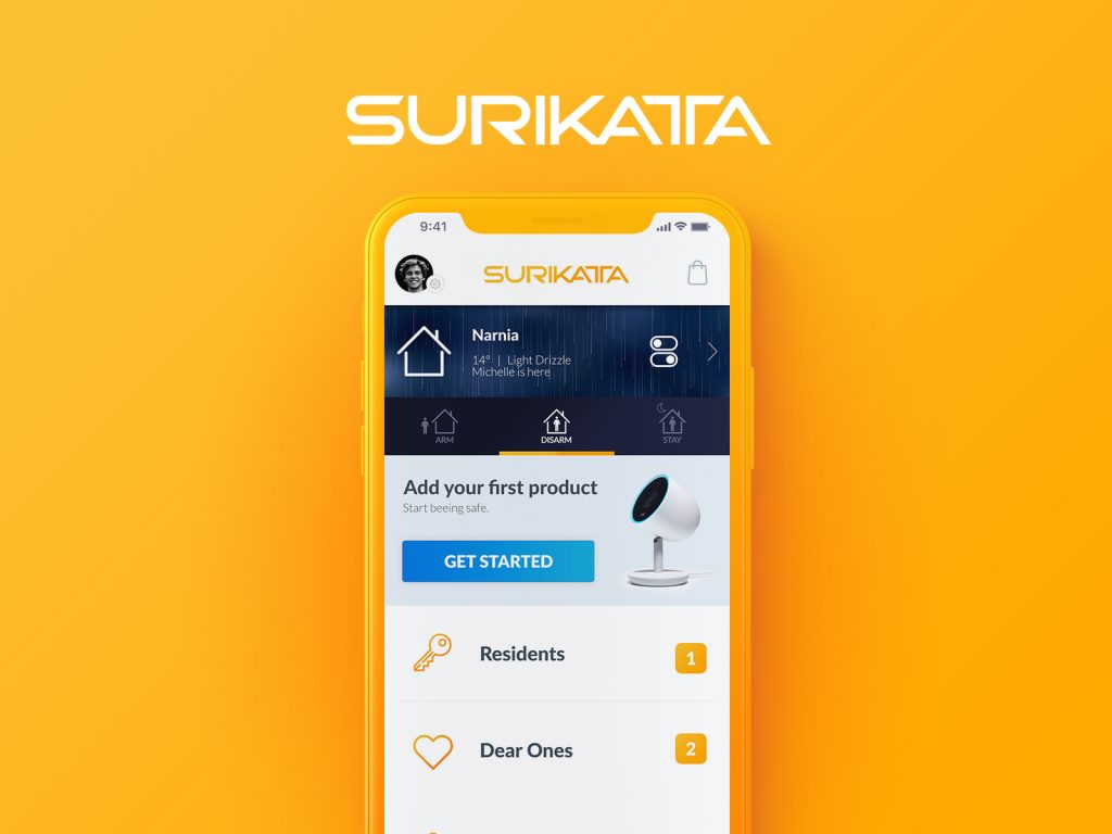
Surikatta is a child company of the larger G4S. They approached us in designing the UI&UX for an iOS App aimed at the US market. The main goal of the app is to create a cohesive and friendly ecosystem with their smart home devices and a social platform where users can warn one another in case of danger.
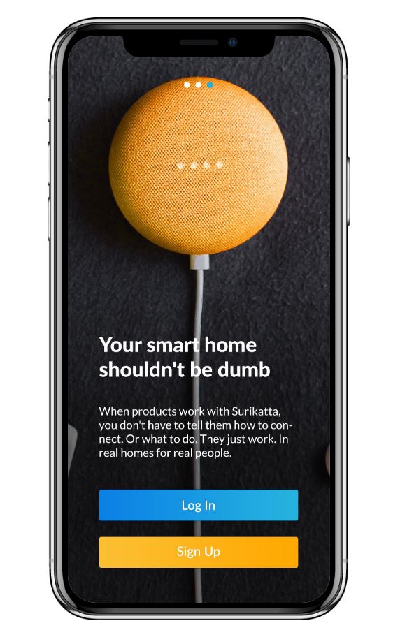
At first, similar to Nest and Ring, Surikatta wants to take the home security idea even further, giving access to your family members, getting notifications from the community, receiving alerts from the local authorities.
The name Surikatta comes from Suricate or Meerkat, and is based on the idea that these tiny animals look after each other, and at the tiniest sign of danger they alert one another.
The Workflow
One of the big challenges was to deliver a well put user experience throughout the entire persona range, from single moms, to older people and even young couples. Besides the UX, we also needed to deliver a trust-worthy feel, by the use of simple layouts, color combinations, icons and animations.
Step 1: Meeting and getting to know the team, and their existing products.
Step 2: Speaking with their target audience, and identifying their needs.
Step 3: Highlighting the strong points and the differentiators from the competition.
Step 4: Initial Layouts & Quick Sketches during the intensive meetings.
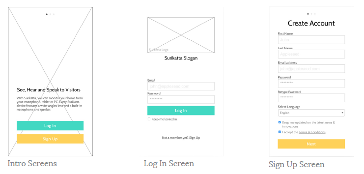
Step 5: Adding all the information into a complete wireframe of 56 screens that make a complete user flow.
Once the Wireframe was done, we started testing it out with the target audience and started to optimize different features or even Entire screens.
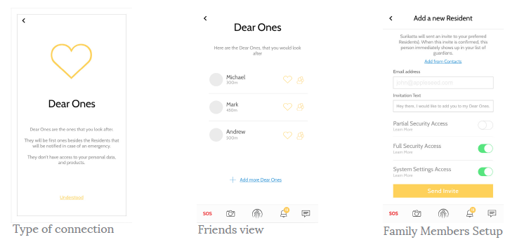
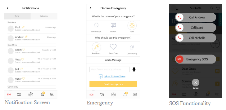
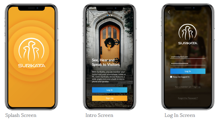
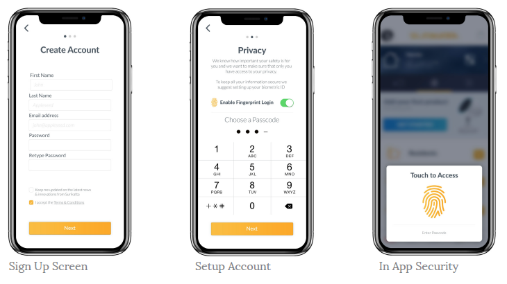
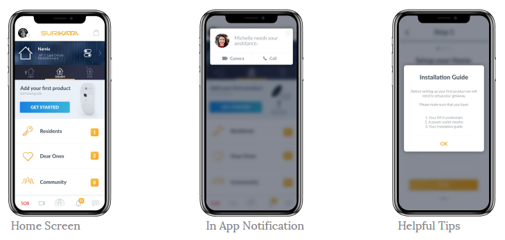
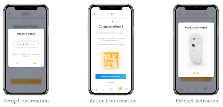
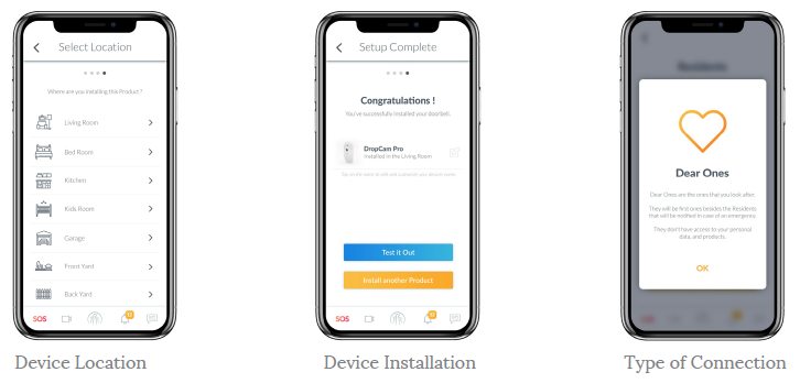
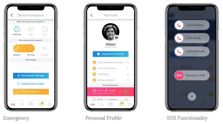
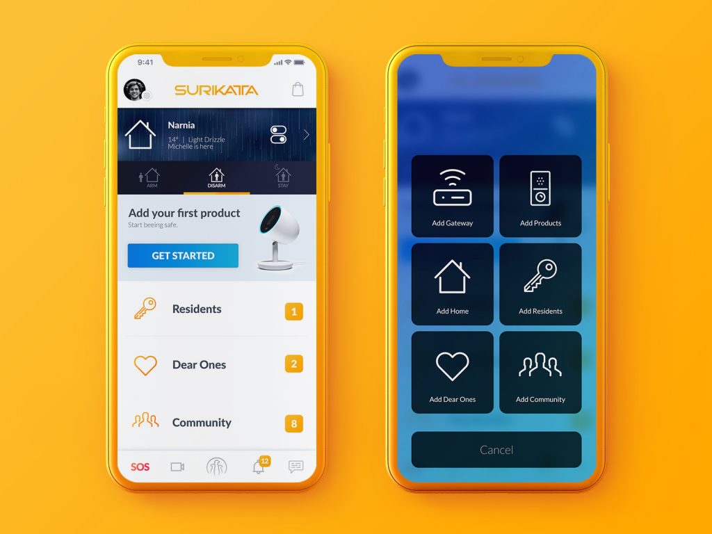
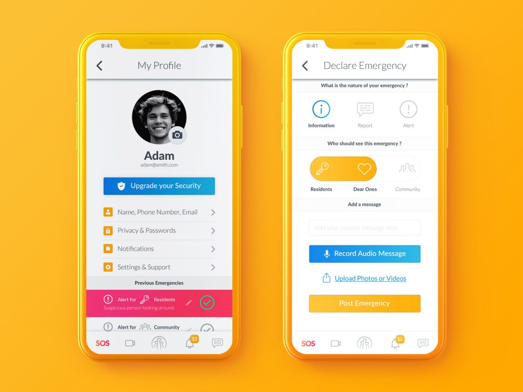
The following print screens are just some of them:
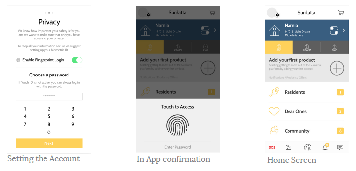
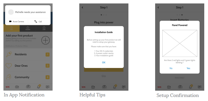
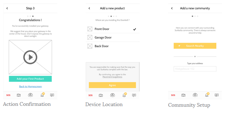
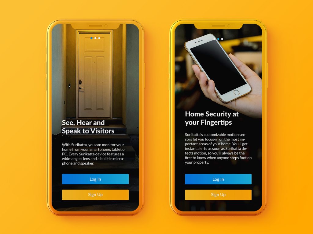
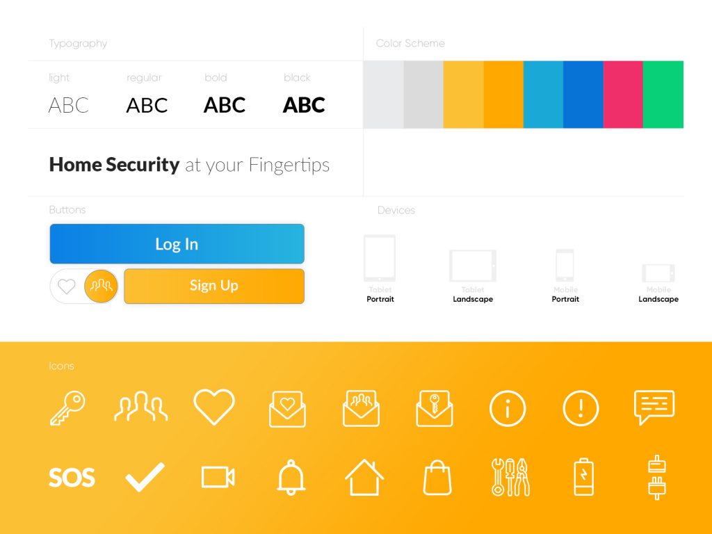
Step 6: Once the Wireframe was completed and tested on the personas, we started defining the Color scheme, fonts, buttons, icons and textures aligned with the Brand Guidelines.
Step 7: After making sure that the design elements were aligned with the image and the direction we were aiming for, we’ve started adding the elements over the finished wireframe.
Below are some examples of them:
Step 8: Transition animations and preparing the files for the Development Hand-off.
Step 9: Starting the Development Phase.
The Challenge
The Challenge was to deliver an app that would carve out its own niche, and have a more human touch compared to its competitors. We also needed to deliver a solid sense of comfort and security, so that the users would feel at home. In order to do this we’ve come up with different screens that put the house and the neighborhood in focus.
The Final Product
This project is in the development stage, we should have a fully working beta this year.
Feel free to take a look at the existing demonstrator: Marvel App
We’ve tested the demonstrator with a range of personas and as us they are awaiting the launch.
Stay tuned.

Give us a follow for a more digital marketing strategy to help or feel free to send us an email at hello@subsign.co for collaborations or help with your brand’s presence and content.